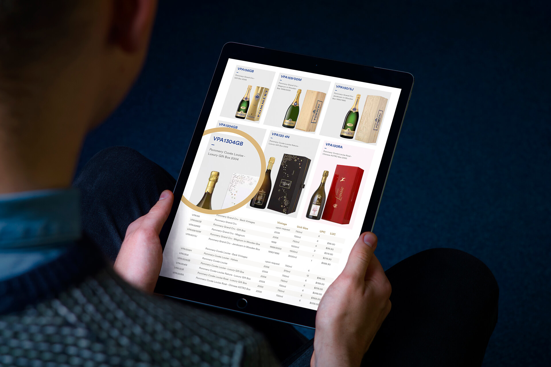
We were approached to create a Brand Portfolio and Digital Sales Toolkit enhancing and telling the story of the Vranken Pommery brand and products, and empowering their sales team to better inform their customers of the range. The goal was to create a label design that stands out on the shelf and reflects the brand’s unique character and values.
BACKGROUND
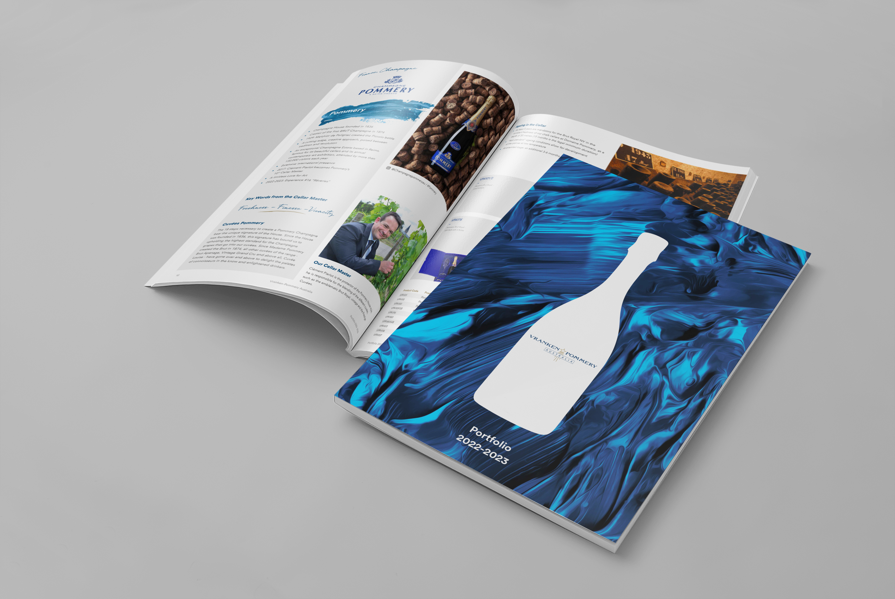
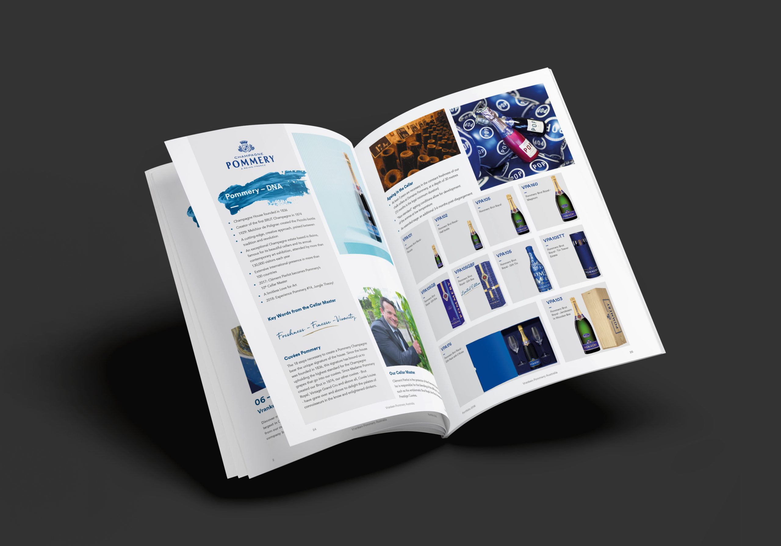
Champagne Pommery has been established as a premium champagne since 1836, originating in France. Pommery are dedicated to their craft of delivering champagne that has style and finesse and focuses on the elegance of the aromas rather than their strength. That is what they stand for, and this ethos is how they wanted every touchpoint of the brand to feel like.
OUR APPROACH
We looked to come up with something that was visually more aligned with their ethos and complemented the designs of their labels on the bottle. We procured speciality printing finishes like blue metallic foil print, selected a paper that gave a silky soft touch, and laminated the front to create a tactile and premium finish. Our approach was to create a memorable design that showcases the brand’s unique character and values, while also capturing the attention of potential customers.
TALKING BUSINESS
From a business standpoint, Champagne Pommery decided to focus on building sponsorships in the Arts of Australia. When they were communicating to this audience, it was their portfolio and price list they shared most often. It’s these two pieces we revisited to feel elevated and premium.